
Figma to Email Template
Email is the one place where web standards from two decades ago still apply. There is no single browser. There are dozens of mail clients, each removing or rewriting parts of your code in its own way, and the sender has no say over which one the reader opens.
We code email templates from Figma designs for that reality. The aim is a message that reads well and keeps its structure everywhere, and looks as designed in the clients that allow it. It will not be identical in all of them, and nobody can honestly offer that.
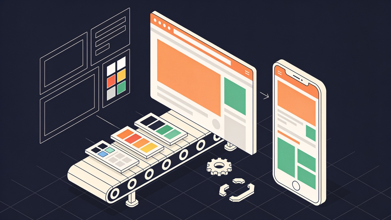
Reasons an email cannot mirror the Figma frame
Each of these is a property of the mail client, not a fault in the code.
Outlook on Windows
The classic desktop version renders with the Word engine. It ignores much of CSS: no flexbox, no grid, patchy padding, no background images without VML.
Fonts
Most clients do not load web fonts. The brand typeface shows in Apple Mail and a few others. Elsewhere a fallback is used, and line breaks move.
Images switched off
Some readers see no images until they allow them. Headlines set as pictures vanish, so important text must be live text.
Dark mode
Clients recolour messages in different ways. Some leave them alone, some invert light backgrounds, some invert everything.
Stripped styles
Certain clients remove the style block or unsupported properties. Anything essential has to be inline.
Message size
Gmail clips long messages past a size threshold and hides the rest behind a link. Heavy templates lose their footer.
How the template is constructed
Old methods, applied carefully.
Tables for layout
Columns and spacing are built with nested tables marked as presentational, so screen readers do not announce them as data.
Inline styles
Every cell carries its own font, colour and padding. A style block adds media queries for clients that honour them.
Hybrid columns
Two and three-column rows are written to stack on narrow screens even where media queries are ignored.
Buttons that are not images
Calls to action are text links with padding and a background colour, with a VML fallback so Outlook shows the same shape.
Conditional code for Outlook
Fixed-width wrapper tables and fallbacks are placed in conditional comments that only Outlook reads.
Dark mode handling
Colour scheme meta tags and a dark style set for clients that support them. Logos get a version or an outline that survives inversion.
Testing routine
A template is not finished when it looks right in one inbox.
Agree the client list
You tell us which mail clients your readers use, from your sending platform's reports if available. That list sets the scope.
Rendering screenshots
The template is run through a rendering test service to capture it in each client, light and dark.
Real inboxes
Test sends go from your own sending platform to real accounts and phones, because platforms alter code on send.
Accessibility and links
Alt text, reading order, contrast and language attribute are checked. Every link is clicked.
Report
You receive the screenshots beside the Figma frame, with each difference named and explained.
What an email design should specify
Designing for email means designing the fallbacks too.
- A desktop frame near 600 pixels wide and a mobile frame
- A fallback system font for each brand font
- Alt text for every meaningful image
- A dark mode frame, or at least dark-safe logo artwork
- Images exported at double size, compressed
- Subject line and preview text
- Which blocks are optional or repeatable
- Footer with postal address and unsubscribe link
Does email suit this design?
Works well
- Single-column layouts with clear hierarchy.
- Solid background colours and simple borders.
- Live text headlines with a sensible fallback font.
- Modular templates built from reusable rows.
Works poorly
- Text laid over photographs.
- Overlapping elements and negative margins.
- Video, forms and script. Most clients block them.
- Animation that the message depends on. Some clients show only the first frame.
On tools and sending
Do you write by hand or use MJML?
Either. MJML compiles to sound table code and is quicker to maintain. Hand coding gives smaller files. We follow your team's preference.
Can the template be editable in our platform?
Yes. Editable regions, repeatable blocks and merge tags are added in the syntax your platform uses.
Will it reach the inbox?
Clean code helps. Delivery depends mainly on sender reputation, authentication records and list quality, which are yours to manage. We make no promise on inbox placement.
Does the new Outlook behave better?
The newer Outlook apps render more like a web client. The classic Windows version is still widely installed, so we test both.
Tell us the platform and the audience
Share the Figma file, name your sending platform and tell us which mail clients matter most. We reply within one business day.